METHODOLOGYThe data utilized in this report were compiled from sources published by various state and federal agencies. When working with statistical data, it is important to distinguish between “population” data sets and “sample” data sets. A list of data sources and terms, with brief descriptions included at the end of the report. Population–Based DataSome of the data reported are “population based,” meaning the entire population of a specified group (or the entire listing of possible values). For example: How many Native Hawaiian infants were born in the State of Hawai‘i in 2016? The “population” in this example is all infants born in the State of Hawai‘i in 2016, of which Native Hawaiian infants are a proportion. This type of population–based data is possible because all births in Hawai‘i are recorded on birth certificates maintained and reported by the State Department of Health. Some agencies are mandated to document all occurrences of specified events, hence, population–based data exist. The data can be limited by completeness and accuracy, but provisions are utilized to minimize their impact. However, not all events or issues can be fully documented due to a pressing need, fiscal restraints, population size, time requirements, and resource limitations. In these cases, where population–based efforts cannot be managed, sampling is often conducted. Sample–Based DataA sample data set contains a part, or a subset, of a population. The size of a sample is always less than the size of the population from which it is taken. The sample can be used as an estimate of the population, assuming responsible sampling protocols are followed. To generalize or extrapolate the findings of the sample to the entire population, the sample must be a random sample and be sufficiently large. By its very nature, drawing 100 random samples from the same population, no two samples will be identical; consequently any conclusions drawn should not be identical, though they should be similar. This uncertainty between a sample and a population can be measured by a means called confidence intervals.. Confidence IntervalsConfidence intervals (CI) are derived from sample statistics. Confidence intervals provide a range of values within which one can have confidence that a value of an unknown population parameter one is seeking is located. Confidence intervals are calculated to provide users different levels of confidence that one can have in their sample. There are many confidence levels for intervals. A common confidence level is the “95% confidence interval.” For example: What percent of Native Hawaiian adults were obese in 2016? A calculation of a 95% confidence interval could be 38.0–46.8. The confidence interval indicates that you can be 95% confident that the percent for the entire adult Native Hawaiian population falls within the range of 38.0% to 46.8%. Keep in mind that 95% confidence indicates that about one time in 20 you are likely to get it wrong. You would not know whether this time is the one time in 20. If this is not acceptable, you can increase the confidence level, to have a greater chance of catching the true population value within it. However, greater confidence comes at a cost. Confidence intervals depend on sample size and often an increased sample size means more time, effort, and resources. Statistically SignificanceDetermining if there is a difference between two measures or if there has been a change in a measure over time can be problematic at times when utilizing survey data. When confidence intervals do not overlap there is a statistically significant difference between the two measures. When confidence intervals overlap, there may be a statistically significant difference, but tests like the t–test or p–values are needed. For example: Is there a difference between Native Hawaiian and State of Hawai˙i adults with diabetes? In 2014, 12.8% of Native Hawaiian adults reported having diabetes, while 9.7% of adults in the State reported having diabetes. It appears that there is a difference, 12.8% compared to 9.7%. But, these numbers are based on survey data. The CI for Native Hawaiian adults is 10.0–15.7, while the state is 8.8–10.7. The two ranges overlap, indicating that there is a possibility that the values are in the overlapping area, hence that there is no difference. 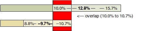 In published reports, graphs with confidence intervals are presented in many ways, below is one example. 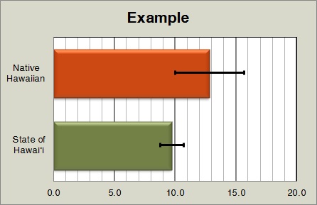 Confidence intervals could be shown as bars with little or no labeling to help assist interpreting the results. Another example involving a trend: Was there an increase in the percent of Native Hawaiian adults who reported having diabetes in 2011 and 2014? In 2011, 9.8% of Native Hawaiian adults reported having diabetes. In 2014, 12.8 % reported having diabetes. It appears that there was an increase from 9.8% to 12.8%. Again looking at the CI, in 2011 it was 7.4–12.1, in 2014 it was 10.0–15.7. Because the two ranges overlap, one cannot state for certain that there was a statistical difference. Additional statistical tests are available to further analyze the measures. Increasing the sample size will alter the confidence intervals. There is a greater chance of identifying the true population value within it. Perhaps there will be a reportable difference at a higher confidence level. Depending on the reporting standards being used and the degree of accuracy desired, there are those who will overlook the confidence intervals and report changes based on the reported measures. In such cases caution must be taken when considering findings and conclusions. TrendsThe report contains two columns summarizing the data related to the health measure. The “Trend Table” compares the Native Hawaiian measure relative to the measure for the State of Hawai‘i , wherever possible. It is generally a simple table illustrating the health measure as it progresses through time. The tables indicate if the Native Hawaiian measure is higher, lower, or at parity relative to the State. It is not a gauge noting that Native Hawaiians are better or worse than the state. Not all lower measures are negative and not all higher measures are positive, it depends on the issue being measured. Moreover, since much of the data presented is based on survey data, there is a statistical margin of error (MOE) or confidence intervals (CI) associated with each measure. Though a measure may appear higher or lower, due to the MOE or CI, the measures may be statically equal. Measures can be different yet statically similar or different and statistically different. While presenting data with margins of error (MOE) or confidence intervals (CI) makes for a sounder understanding of the data presented, it complicates the interpretation and understanding of the data. Some may choose to base an assessment solely on the measure’s data while others may opt to take into account the accuracy of the data. Different conclusions could be draw based on the same data; either conclusion could be sound from a particular perspective. The accompanying “Trend Graph” column is a graphical presentation of the data in the previous tables. The graphs display the Native Hawaiian data over time to illustrate if there is a trend and if the trend is increasing, decreasing, stable, or variable. As with the “Trend Table” column, trends may appear to be increasing or decreasing, but due to the MOE or CI, trends may not be what they seem to be. Generally, health related matters change very slowly over time, and it could take a long period for statistically significant changes to appear. There are many different types of trend lines/regression lines, the most common are: 1) linear trendline is most suitable for simple linear data sets. Data is linear if the pattern in its data points resembles a line. A linear trendline usually reveals that something is increasing or decreasing at a steady rate, 2) logarithmic trendline is most useful when the rate of change in the data increases or decreases quickly and then levels out. A logarithmic trendline is useful since it can use negative and/or positive values. The data table in this report indicates that much of the data fluctuates. In such situations the 3) polynomial trendline is most appropriate for analyzing gains and losses over time. The trendline formula adjusts according to the number of fluctuations in the data or by how many bends (crests and troughs). Associated with a trendline is a value known as R–squared (R2). R–squared is a statistical measure of how close the data are to the fitted trendline. R–squared is always between “0” and “1,” where “0” indicates that the model explains none of the variability while “1” indicates that the model explains all the variability. The R–squared value can be a critical value in data trend analysis, but for our purpose it was used to determine which type of trendline best illustrates what is happening to the data over time. In our examination, we are only interested in the general trend of the data. We are not concerned with how well a trendline equation supports the data trend or in forecasting. A trendline was not calculated for selected graphs. If there 1) too few data points, three or less, or if there was 2) a break in data collection periods, there is no trendline. |